
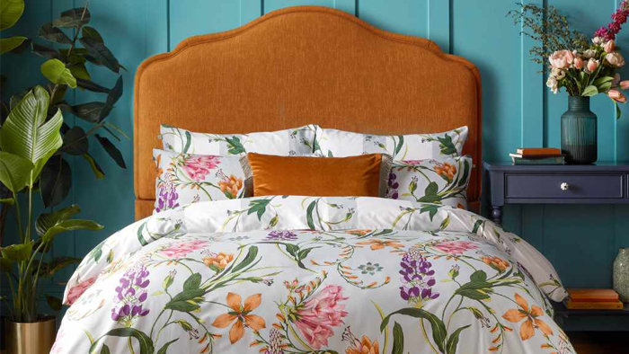
Create a Calm, Characterful Bedroom Sanctuary
Pattern and colour in the bedroom are not just about looks; they change how a space feels and how well we relax. The right mix can make a room feel calm, cosy and pulled together, even if the rest of the house is a bit busy. A well-balanced bed often becomes the main focal point in the room, which is very handy in typical UK homes where space can be tight.
Many people worry about getting it wrong. Prints that clash, colours that feel too loud, bedding that looks dated after a short time, it can all feel a bit risky. At Fab Furnishings, we spend a lot of time helping people balance character and calm, so we like to keep things simple and friendly rather than chasing short-lived trends.
Here we share easy ideas for using designer bedding in the UK, with tips that work in smaller bedrooms, north-facing rooms and for our changeable seasons. You will pick up some simple rules for mixing patterns and colours, plus some brand examples you can explore when you feel ready for a refresh.
Start with Your Bedroom’s Natural Palette
Before choosing new bedding, it helps to look at what is already in the room. Your walls, flooring, wardrobe and bedside tables, even curtains or blinds, all set a base palette. These are the fixed elements that are harder to change, so bedding works best when it feels at home beside them.
Think about a base bedding colour that supports what you already have:
- Soft neutrals like ivory, stone or light grey for maximum flexibility
- Deeper tones like navy or forest green for a snug, cocooning feel
- Clean white if you like freshness, paired with texture so it avoids looking clinical
UK light levels matter too. In north-facing rooms or rooms that feel a bit gloomy, warmer and lighter bedding can lift the space, think warm whites, creams, blush, soft golds. In sunny, south-facing rooms, fresh tones like crisp white, light blue or cool green can balance the brightness and keep things restful.
A simple way to plan your colours is the 60/30/10 rule:
- 60% main colour, often your duvet cover or main bedspread
- 30% supporting colour, perhaps pillowcases and a throw
- 10% accent colour, used on cushions or a small decorative pillow
For example, your main colour might be a soft grey duvet set, your supporting colour a muted blush throw and pillowcases, and your accent colour a touch of deeper berry on two cushions.
Easy Rules for Mixing Patterns with Confidence
Pattern feels scary until you give it a few boundaries. One of the easiest tricks is to think about pattern scale. Choose one large-scale hero print, then mix it with smaller or simpler patterns so the bed does not feel too busy.
Some examples of great hero prints are:
- Flowing botanicals from Morris & Co
- Bold, retro-style motifs from Orla Kiely
- Statement scenes or birds from Sara Miller
Pair these with smaller stripes, tiny geometrics or soft ditsy florals so the eye has places to rest. Try to stay within a family of colours. If your hero print uses teal, soft green and cream, keep the other patterns in that same area so the whole bed feels calm rather than chaotic.
If you feel unsure about mixing lots of prints, texture is your friend. Quilted throws, knitted blankets, fringed or embroidered cushions add interest without adding more pattern. Texture acts like a quiet pattern and can stop a bed from looking flat.
A few practical layering ideas that work well for sleep:
- Keep bold patterns on the duvet cover or top cushions
- Use calmer plains or very small prints on the bottom sheet and standard pillowcases
- Add pattern again at the foot of the bed with a runner or folded throw
This way, when you lie down, the area around your face feels soothing, while the overall bed still has character.
Seasonal Switch-Ups for Designer Bedding in the UK
Our weather does not always match the season, so bedding needs to be flexible. Late summer into autumn is a lovely time to start deepening colours and adding texture without changing everything at once. You might keep a fresh cotton duvet set, then add:
- A heavier knitted or quilted throw in a richer tone
- Deeper cushion colours like rust, plum or olive
- A second pair of pillowcases in a warmer shade
For the move from summer to winter, breathable cotton is still a good base for designer bedding in the UK, as it copes well with temperature changes. Then you can layer:
- Light quilts you can add or remove
- Brushed cotton sheets for extra cosiness on cold nights
- Velvet or faux fur cushions for touchable warmth
Rotating accent colours through the year keeps things interesting. In spring and summer, many people enjoy soft pastels, coastal blues or fresh greens. Brands like Scion Living, Sophie Allport or Wrendale Designs often have gentle animal or nature themes that feel seasonal without being too strong. In autumn and winter, rusts, forest greens and jewel tones like teal or berry feel comforting.
When you switch bedding for the season, good storage keeps patterns looking crisp. Let sets air fully before storing, fold them loosely, and keep them in a cool, dry place away from direct sunlight so colours stay fresh.
Bringing Personality Into Family and Guest Bedrooms
Family bedrooms often need to work hard. In children’s rooms, bright colour and fun prints are lovely, but it is easy to go overboard. One simple approach is:
- Let the duvet cover be the playful star
- Keep sheets and pillowcases simpler and mostly plain
- Add one plain throw to ground the bed
If children are choosing, ask them to pick one fun element that feels special, maybe a patterned pillowcase or pillow, then tie the rest of the bed back to the wall colour so the room still feels calm enough for sleep.
Guest rooms do not need to be bland to feel like a hotel. One distinctive designer pattern, such as a Portmeirion floral or a gentle Sara Miller print, can sit with neutral sheets and a plain throw for a welcoming look with personality.
In small UK bedrooms or rentals where you cannot change walls or carpets, bedding becomes your main design tool. Choose one or two colours you love and repeat them in:
- The duvet set
- Cushions and throws
- Lampshades or a simple rug
If you are on a budget, a full new bedding set is not always needed. Swapping just pillowcases, cushion covers or adding a new throw can give existing designer bedding a fresh feel.
Pull Your Look Together with Thoughtful Finishing Touches
A simple formula helps when you feel stuck: one hero pattern, one quieter supporting print or texture, and two or three repeating colours across your duvet, pillows and throws. Start with your favourite design, maybe from Orla Kiely, Morris & Co or Sara Miller, then build around it with matching plains and textures rather than buying lots at once.
At Fab Furnishings, we see bedding as a bit like a wardrobe for your home. Pieces can move between rooms, work in different seasons and change as family life changes. There are no strict rules, only what helps you feel relaxed when you walk into the room and when you switch off the light. With a few simple colour and pattern ideas, designer bedding in the UK can be both calm and full of character, helping every bedroom feel that little bit more special.
Transform Your Bedroom With Thoughtfully Chosen Designer Bedding
Discover how Fab Furnishings can help you create a bedroom that feels luxurious, coordinated and truly personal with our carefully curated range of designer bedding in the UK. Whether you prefer classic elegance or bold contemporary looks, we make it simple to find pieces that suit your style and budget. If you would like guidance or have any questions about colours, sizes or styling, just contact us and we will be happy to help you choose the right options for your home.